Month: November 2016

West Tower Records

West tower records was a proposed record company located in Liverpool’s Beetham West Tower.

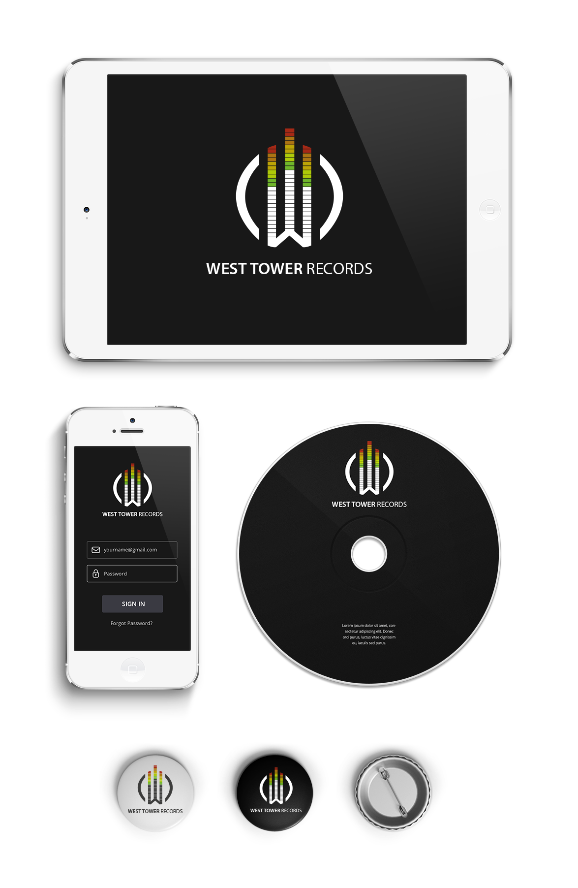
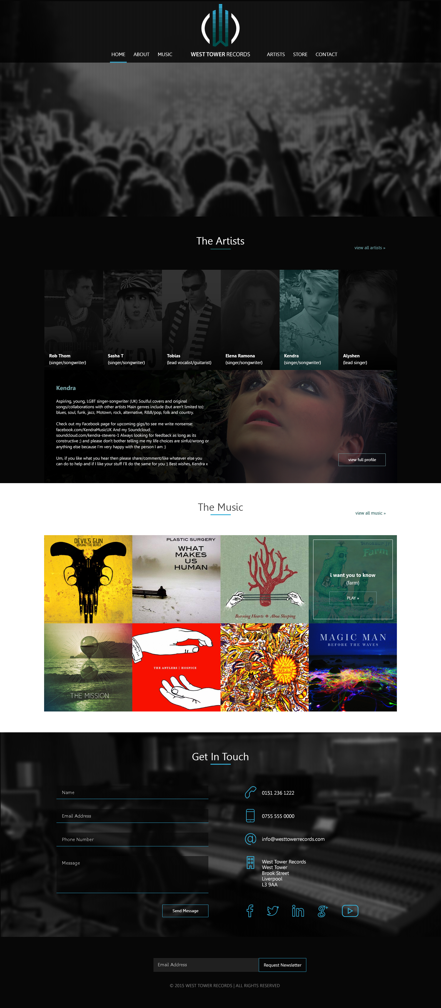
I was asked to design a logo and website for the company. i tried to encapsulate some of the buzzwords from the initial meeting. What I created was a logo which invoked a feeling of power and sound. I created a rudimentary W which I styled to look like the base of a tower. The shape with the split lines and colours created the equalizer you would find on a mix deck. The W shape was held between 2 brackets creating a power button effect. A second version of the logo was created in blue. This was seen to match the colour of Beetham Tower where the company was based and can be seen below on the web mockup.

Powder Room

The powder room is a boutique makeup and hair salon based in Liverpool. After investing in their SEO strategy the owner felt that the website was no longer fit for purpose.

I was approached to design and develop a new website and recommend a new hosting company. After the initial meeting it was clear that the owner had a good idea of what they were looking for. We made some sketches at the initial meeting and I went away and created a design concept. The owner was extremely happy with the design and asked for development to start immediately.

The site is fully responsive and was designed in Photoshop and developed in WordPress using foundation as the responsive framework. It was styled using SASS

SON OF 8

This was a web project for a pair of DJs from Liverpool. They had a website but it didn’t portray the image they were trying to harvest. I met with them and created a user persona. From here we were able to list everything that was important to the user and what needed to be on the site.

After a couple of prototypes I moved forward with the design and finally the development. It was important that there was a hero video filling the screen and the use of CSS animation gave the site a further dimension.

The social feed meant that the website would stay current as their marketing team updated the social media pages. The site is fully responsive and was designed in Photoshop and developed in WordPress using foundation as the responsive framework. It was styled using SASS

PMC Family Law

PMC is a family law solicitors based in Liverpool. I was asked to create the brand identity for the new company and was given the simple direction that it needed to be clean and have a boutique feel to it.

The first thing was to create some mood boards to give the director a feel of different colour schemes. The director decided very early that the light green was the best choice. The colour was accented through the company’s office in it’s decoration.

I then went to create the logo in both a light and dark version. Once the client was happy the rest of the stationary was created. This included letterhead, email signature and business cards.

The website was created in WordPress using foundation as the responsive framework.